Requirements:
- Strong information hierarchy
- Strong information hierarchy
- Sophisticated, contemporary aesthetic
- Highlight human centric product
- Avoid gloomy cybersecurity aesthetic
The first one I designed provided the template for the rest.
It was important to me to include some kind of blue background, as it is a core feature of our visual brand. However, I wanted to keep it soft and the emphasis on the text.
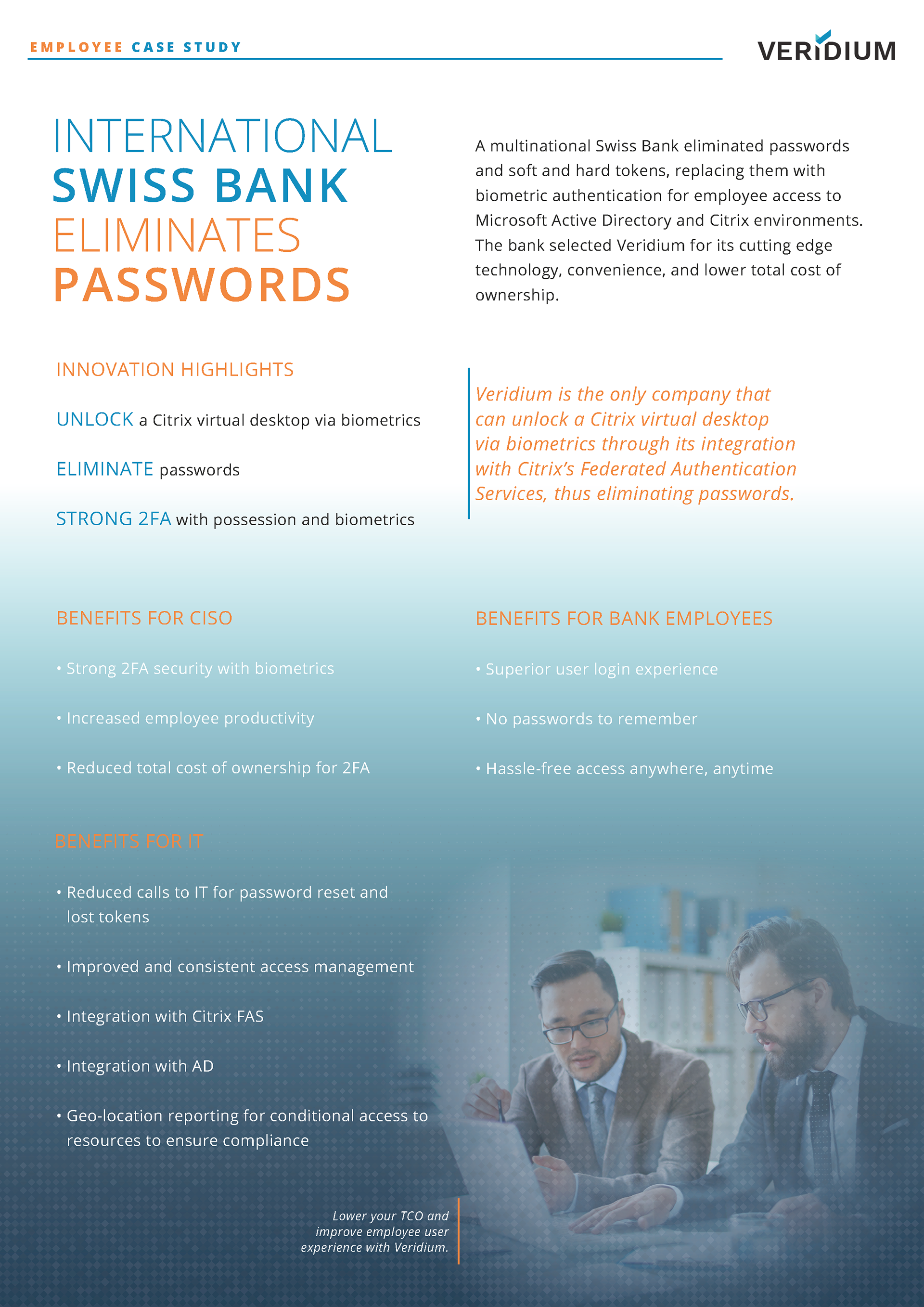
"Swiss Bank" was the first one I made and it served as a guide for the rest.
It was important to me to include some kind of blue background, as it is a core feature of our visual brand. However, I wanted to keep it soft and the emphasis on the text.
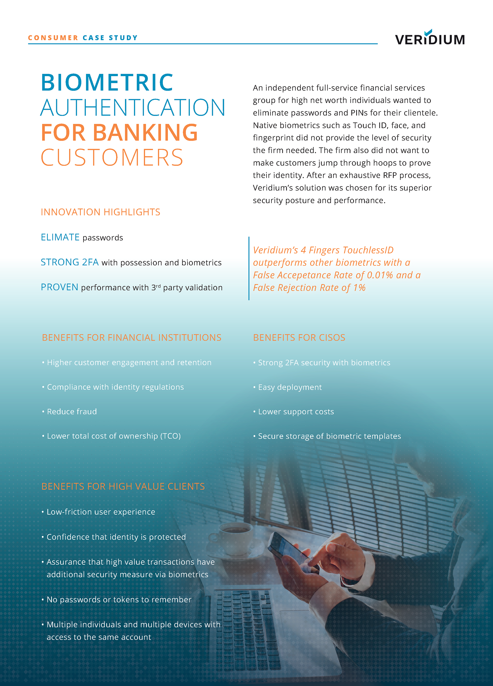
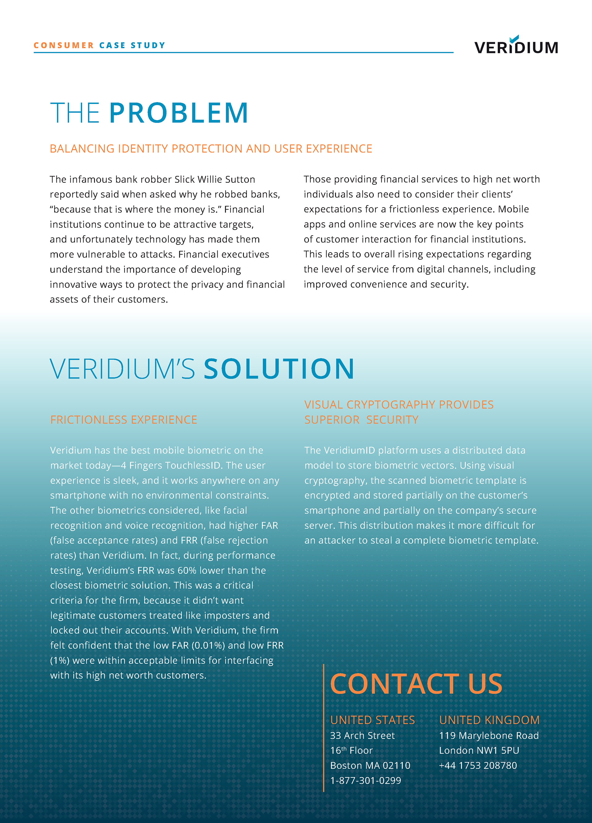
The case studies and our data sheets needed to be part of a harmonious suite of product marketing materials, but at the same time each needed to be differentiated. Additionally, we wanted to differentiate between consumer implementations and employee implementations.
I achieved this by using a small kicker, inspired by one my intern created for a different iteration.